
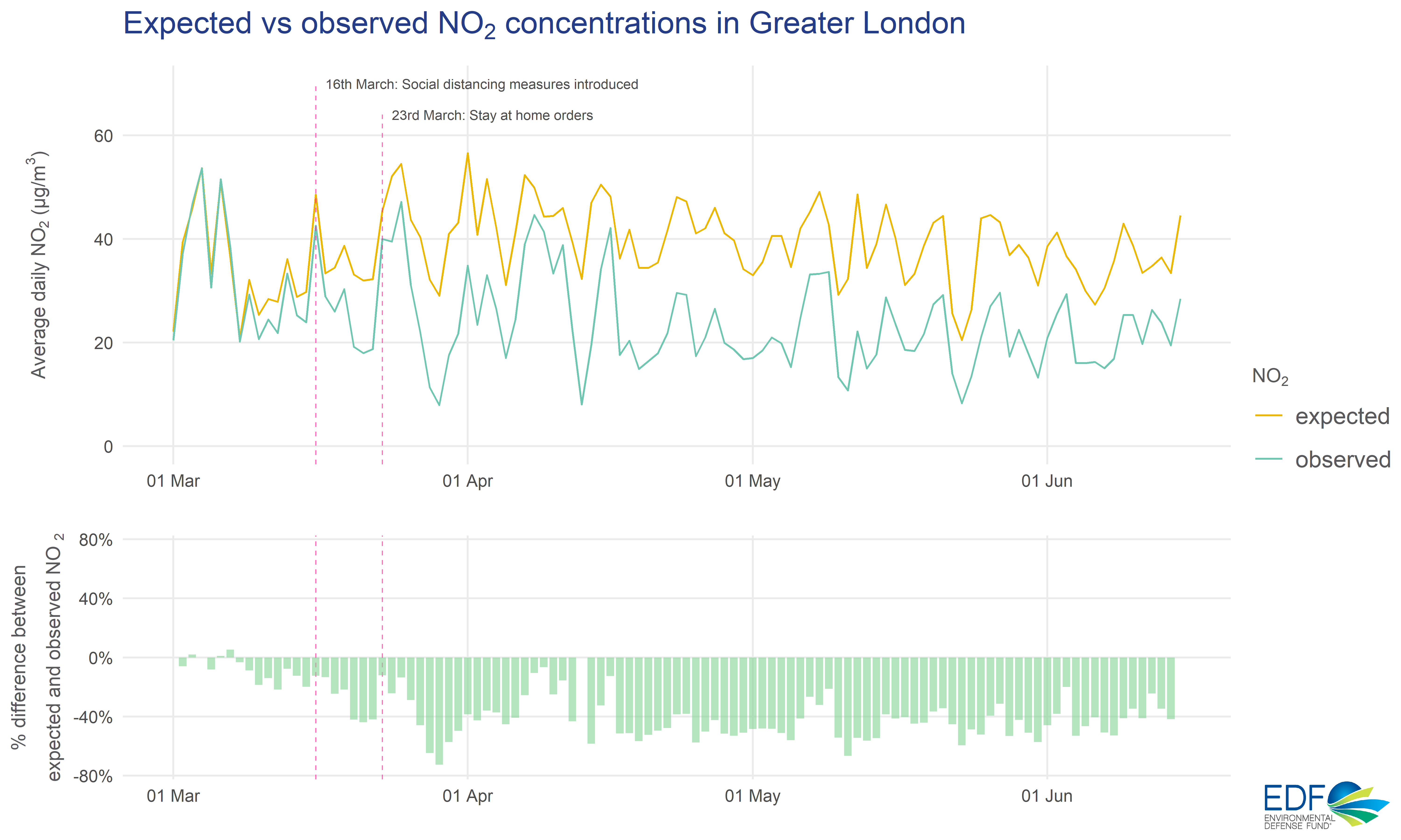
A new analysis for UK Clean Air Day from Environmental Defense Fund Europe (EDF Europe) finds nitrogen dioxide (NO2) pollution was 40% lower than expected across London during the initial COVID-19 lockdown.
But how do we know about pollution that didn’t happen? We used a machine learning model to predict what the concentration of NO2 would have been if lockdown restrictions had not come into effect. Here’s how it works.
Removing the weather impact
Meteorology and seasonal patterns have a big impact on air quality, which needs to be taken into account when measuring changes in pollution. For example, a windy day could improve air quality by dispersing pollutants that might have otherwise accumulated locally. Meteorological and seasonal variations like this make it difficult to directly compare one period to another – are changes in pollution due to a policy intervention or behaviour change, or is it just the weather?
We wanted to isolate the impact of lockdown measures on London’s NO2 pollution, which is produced from fossil fuels and is associated with heart and lung-related health impacts.
Using open-source tools developed by researchers at the University of York (Grange, 2020), and data from over 100 regulatory air quality monitors, we built a machine learning model to help us do this. London’s long-running monitoring network provides years’ worth of historic pollution data, which is used to train and test the model, alongside a series of meteorological and temporal variables.
We can then use this model – with time and weather information from lockdown dates – to predict the pollution levels we would have expected to see had lockdown measures not occurred. These predictions mirror seasonal and meteorological changes in observed pollution levels much more closely than an historical average, for example, which may vary due to different weather during that period.
As a result, with this method the difference between expected and observed levels can be more directly attributed to the impact of lockdown restrictions rather than random weather variations.
40% less pollution
The figure above shows a comparison between average expected and observed NO2 concentrations. The gap between what we expected to see and what we actually saw increases dramatically after 16th March, when social distancing was strongly advised. The figure shows the close alignment of trends between expected and observed levels, illustrating how both are similarly influenced by meteorological effects during the period.
Overall, we found a 40% difference from mid-March to mid-June 2020 – i.e. NO2 pollution levels were 40% less than what the model predicted during lockdown. This is the average change across London’s different monitoring site types, including those close to roads (kerbside and roadside) and farther away from busy streets (urban background and suburban).
Changes in meteorology over time typically complicate air quality intervention analysis, but a machine learning method like this allows us to better isolate changes associated with interventions, like lockdown measures. This method has been used successfully in other recent air quality research – for example, Grange and Carslaw (2019) – and we will continue to use cutting-edge methods like this to better understand how London’s pollution levels are changing.
This analysis complements our previous lockdown assessment using data from the Breathe London monitoring network. We used data from the regulatory monitors here rather than Breathe London because training the model requires a longer historical record.
References:
-
Grange, S. K. (2020). rmweather: Tools to Conduct Meteorological Normalisation on Air Quality Data. Version 0.1.51. URL: https://cran.r-project.org/package=rmweather
-
Grange, S. K. and Carslaw, D. C. (2019). Using meteorological normalisation to detect interventions in air quality time series. Science of The Total Environment 653, pp. 578--588.